App Design
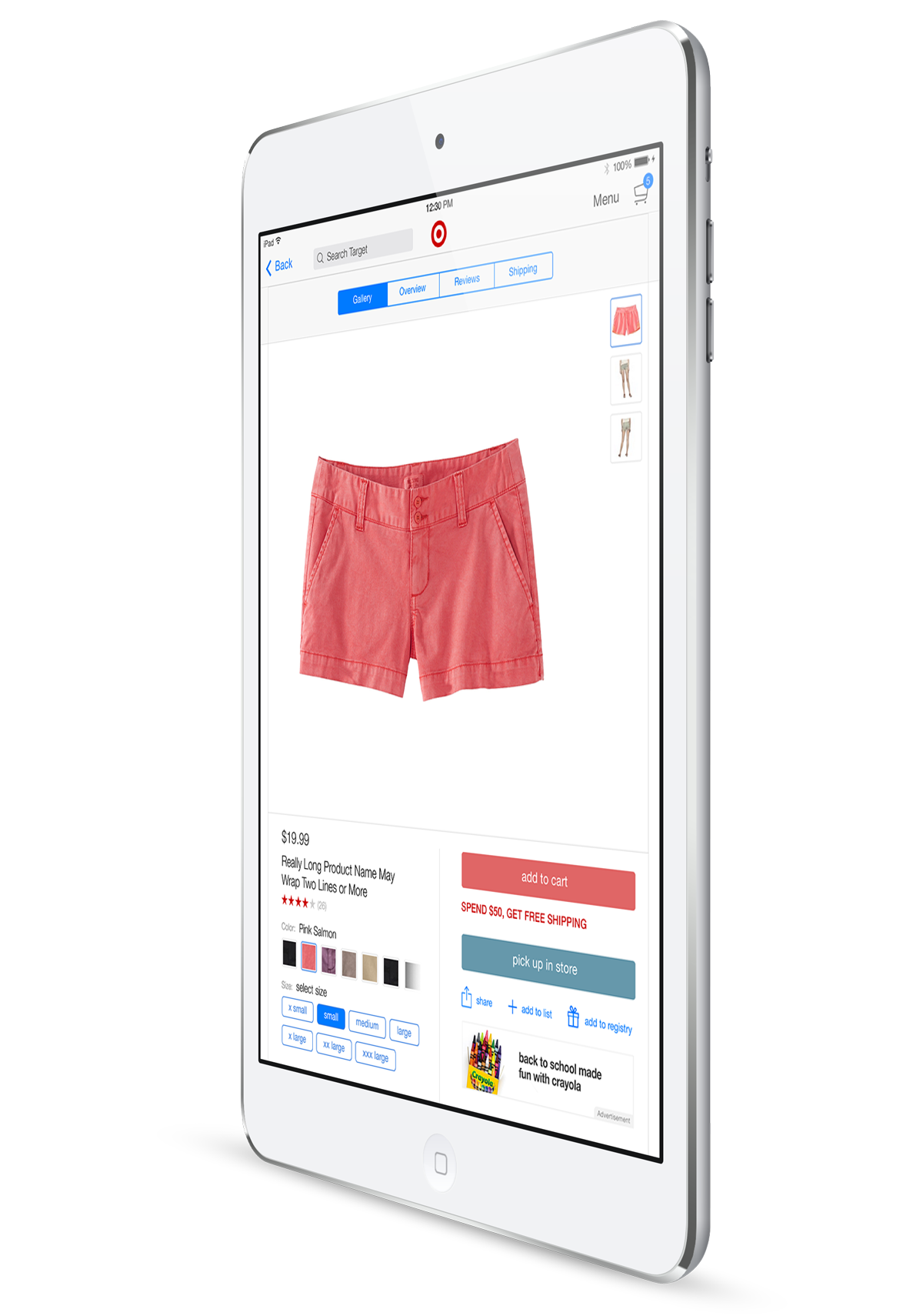
Target for iPad
Discover an inspirational shopping experience for Target right on your iPad.
Target wanted a refresh of its iPad app that would not only but it up to the standard of their other apps but also provide a new shopping experience tailored for how it's customers use their iPads.
Working at Fluid with some of our best minds on the design and strategy teams I helped conceive a new experience for the Target app that would delight and engage users along with an efficient shopping experience. Once the vision for this project was established I was tasked with being the main Interaction Designer that would bring this new concept to life working along side a Visual Designer and a team of product managers at Target.
Role
Lead Experience Designer
Agency
Fluid
Collaboration with the client
The kickoff for this project involved working sessions directly with the client to establish goals and features for the new experience. These were lead by our VP of UX and our Creative Director along with the Creative Lead from Target. We were able to get valuable data and insights from a range of presentations and exercises to fuel our creative process for the project.
Product Goals
Destination for discovery & delight
Engaging & efficient shopping experience for users
Experimenting with flows
We created a variety of flows that broke the mold of the traditional shopping apps we had seen on the iPad. There was a lot of trial and error here and it served as a great way to weed out ideas that couldn't hold and also allowed us to refine our strong ideas into cohesive concepts.
The experience model
We established experience dimensions leveraging device attributes and guest behaviors. This process would lay the framework for how all of the pieces of the new experience would fit together.
Prototyping & user testing
Rapid prototypes were made to test design decisions and quickly get stake holder buy-in.
Usability testing was conducted during the beginning of the project to understand the short comings and opportunities of the previous app. After establishing a concept and design direction we brought a prototype to a physical Target store to get feedback from real customers.
Inspirational browsing providing a unique experience for the Target iPad user
Styles & ideas
Pulled from the Target Instagram community through the #targetstyle hashtag including links to the featured products.
This project successfully launched and was featured in the App Store.
Increases:
Year-over-year conversion rate by 200%
Cart to check out rate by 350%
Revenue by 150%
Product view per visit by 70%
Sign in rate by 2500%
Percent of user time on site over five minus by 10%
App store review from 2 star to 4 stars in 6 months
Additional credits
Hae Yin-loke - VP of XD
Anne Sophie Hurst - Account Director
Matt Sugihara - Interaction Designer
Ashley Auld - Director of UX
Michael Janiak - Creative Director
Jeremy Elliot - Lead Visual Designer
Tony DeKleine - Visual Designer
Amy Lanigan - VP of Strategy


